妄想プログラマのらくがき帳 : Android
ラベル Android の投稿を表示しています。 すべての投稿を表示

2015年5月20日水曜日

[Android]ボタンの背景を変える(設定する)

  • ボタンの背景を静的に設定する
ボタンの背景を静的に設定するには、xmlファイルのボタン要素にbackground属性を追加します。
以下がボタンに背景色を設定する場合のxmlファイル例です。
<Button
    android:id="@+id/button1"
    android:layout_width="wrap_content"
    android:layout_height="wrap_content"
    android:layout_alignParentTop="true"
    android:layout_centerHorizontal="true"
    android:layout_marginTop="64dp"
    android:text="Button" 
    android:background="#ff0000" /> <!-- 背景色をRGBで指定 -->
ボタンに背景画像を設定する場合は、[res]-[drawable]フォルダに画像を置き、
次のようにbackground属性を設定します(以下の例は、drawableフォルダにbutton_background.pngを置いた場合の例です)。
<Button
    android:id="@+id/button1"
    android:layout_width="wrap_content"
    android:layout_height="wrap_content"
    android:layout_alignParentTop="true"
    android:layout_centerHorizontal="true"
    android:layout_marginTop="64dp"
    android:text="Button" 
    android:background="@drawable/button_background" /> <!-- 背景画像を設定 -->

  • ボタンの背景を動的に設定する
ボタンの背景色を動的に設定するには、Button.setBackgroundColor()を使います。
Button button = (Button) findViewById(R.id.button1);
button.setBackgroundColor(Color.rgb(0, 100, 200));

背景画像を動的に設定するには、Button.setBackgroundResource()を使います。
Button button = (Button) findViewById(R.id.button1);
// drawableフォルダに置いたbutton_background.pngを背景に設定
button.setBackgroundResource(R.drawable.button_background);

  • ボタンの状態に応じて背景が変わるようにする
ボタンがフォーカスされたときや押されたときに背景が変化するようにするには、
State List Drawableを作成し、xmlでbackground属性に指定します。

1. State List Drawableを作成する。
まず、以下のようなxmlファイルを作成し、[res]-[drawable]フォルダに配置します。
xmlファイル名は何でも良いんですが、とりあえず"custom_button.xml"としました。
<?xml version="1.0" encoding="utf-8"?>
<selector xmlns:android="http://schemas.android.com/apk/res/android">
    <item android:drawable="@drawable/button_pressed"
          android:state_pressed="true" />
    <item android:drawable="@drawable/button_focused"
          android:state_focused="true" />
    <item android:drawable="@drawable/button_default" />
</selector>
item要素でボタンに設定する画像をリストアップします。
android:drawableに設定する値は、drawableフォルダ内の画像ファイル名です
(button_default.pngの場合、"@drawable/button_default"を設定します)。

android:state_pressed="true"の要素には、ボタンが押下されたときに設定する画像、
android:state_focused="true"の要素には、ボタンがフォーカスされたときに設定する画像を指定します。

2. ボタン要素のbackground属性に、作成したxmlファイルを設定する。
xmlファイルのボタン要素のbackground属性に、以下のように先ほど作成したxmlファイルの名前を指定します。
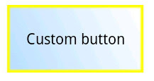
<Button
    android:id="@+id/btnCustom"
    android:layout_width="wrap_content"
    android:layout_height="wrap_content"
    android:layout_alignParentBottom="true"
    android:layout_centerHorizontal="true"
    android:layout_marginBottom="172dp"
    android:background="@drawable/custom_button"
    android:text="Custom button" />
以上で、ボタンの状態に応じてボタン背景が設定した画像に変わるようになりました。

@通常時


@フォーカス時


@ボタン押下時


2015年1月25日日曜日

[Android]AndroidStudioでエラーが出てエミュレータが起動しない場合の対処法

AndroidStudio でコードを書いていざデバッグ!というときに「emulator: ERROR: x86 emulation currently requires hardware acceleration!」というエラーが出てエミュレータが起動しない場合があります。私の場合、AndroidStudioをインストールして一番最初のデバッグ実行時にこのエラーが出ました。


ふむふむ、エラーメッセージによると「Inter HAXM をちゃんとインストールして使えるようにしてくれ」とのこと。。
あれえ?おかしいなあ、HAXM はインストールしたのになあ…と思ったんですが、調べてみたらインストールできてませんでした。おかしいのはどうやら私の頭の方だったようで(;^_^A  改めて HAXM をインストールし直したらエミュレータが起動しました\(^o^)/

つまり、上記のようなエラーが出てエミュレータが起動しないのは、エラーメッセージにあるように HAXM がインストールできていない、または使えるようになっていないからです。ということで、HAXM のインストール方法を以下に記します。

HAXMのインストール条件

HAXM をインストールするには、ハードウェアと OS が HAXM のシステム要件を満たしている必要があります。具体的には、CPU が
  • Intel® VT-x
  • Intel® EM64T (Intel® 64)
  • Execute Disable (XD) Bit
をサポートしている必要があり、OS は Windows Vista 以降でなければなりません。詳細は Installation Instructions for Intel® Hardware Accelerated Execution Manager の「System Requirements」を参照してください。

ちなみに CPU がサポートしている機能は Intel® Product Information で確認できます。

HAXMのインストール方法

HAXM のインストール条件が整っていることが確認できたら、以下の手順で HAXM をインストールします。
  1. BIOS で VT-x と Execute Disable (XD) Bit を有効にする
    まず最初に BIOS で VT-x と Execute Disable (XD) Bit を有効にしておく必要があります。BIOS の設定項目で VT-x と Execute Disable (XD) Bit を探し出し、Enabled にして設定を保存、パソコンを再起動してください。
    ※BIOS での設定項目名は環境によって異なるので、注意深く探してみてください。
  2. SDK Manager で Intel x86 Emulator Accelerator (HAXM installer) をインストール
    次に SDK Manager で Intel x86 Emulator Accelerator (HAXM installer) をインストールします。

  3. HAXM のインストールフォルダ※を開き、「intelhaxm-android.exe」を管理者権限で実行します。
    ※インストールフォルダは環境によって違うかもしれません。私の場合「C:\Android\sdk\extras\intel\Hardware_Accelerated_Execution_Manager」でした。
3の手順が問題なく完了すればインストール完了!これでエミュレータが起動するようになるはずです。

メモリ上限サイズの設定

インストールの途中でメモリ上限サイズの設定があります。


ここで設定する上限サイズですが、1つ注意しないといけない点があります。ここでの設定値が AVD のメモリサイズより小さい場合、「HAX is not working and emulator runs in emulation mode」「emulator: The memory needed by this VM exceeds the driver limit.」というエラーが出て HAX が有効になりません。


HAX を有効にするには、再度「intelhaxm-android.exe」を実行して上限サイズを変更するか、AVDのメモリサイズを上限サイズより小さくする必要があります。

2015年1月12日月曜日

[Android]AndroidStudioをインストールしてみた。

去る2014/12/09に AndroidStudio 1.0 がリリースされました。
ということで、ちょっと遅くなりましたが AndroidStudio をインストールしてみました。
※インストール手順は2014/12/30時点での手順です。

インストーラーをダウンロードする

まずインストーラーをダウンロードします。下記場所からインストーラーをダウンロードしてください。

Download Android Studio and SDK Tools
  1. 緑色の「Download Android Studio for Windows」ボタンをクリック。
  2. 利用規約が表示されるので、よく読み、同意なら、「I have read and agree with the above terms and conditions」チェックボックスをチェックし、青色の「Download Android Studio for Windows」ボタンをクリック。

AndroidStudioをインストールする

次に AndroidStudio をインストールします。
  1. ダウンロードした .exe をクリックしてインストーラーを起動します。
    1. JDK がインストールされていない場合、JDK要求画面が表示されるので、JDK ダウンロードページへのリンクをクリックし、JDK インストーラーをダウンロードしてください。
      JDK要求画面

    2. JDK ダウンロードページですが、JDK は CPU と PSD がある場合は CPU を選択し、開発環境のプラットフォームに合った .exe をダウンロードします。
    3. ダウンロードした .exe をクリックし、インストーラーに従って JDK をインストールします。
    4. Android Studio のインストーラーに戻り、JDK のインストール先パスをテキストボックスに設定します。
      ※Windows の JDK デフォルトインストール先「C:\Program Files\Java\jdk1.7.0_71\bin」を入力する場合、パスにスペースが含まれるため、パスをダブルクォーテーションで囲む必要があるので注意。まあパスにスペースがあると駄目なケースは結構あるので、3で JDK をインストールするときにインストール先パスをスペース無しの場所にした方が無難です。

  2. コンポーネント選択画面が表示されます。特に理由が無ければデフォルト設定で「Next」を押し次へ進みます。
    コンポーネント選択画面

  3. ライセンス条項が表示されるので、同意するなら「I Agree」ボタンを押し次へ進みます。
    ※当然ですが、同意しないと先へ進めません
  4. Android Studio と Android SDK のインストール先設定画面が表示されます。デフォルトで問題ないならそのままで、変更が必要ならパスを変更し、「Next」ボタンを押し次へ進みます。
    インストール先設定画面

  5. エミュレータ設定画面が表示されます。ここでエミュレータが使用するメモリサイズを設定しますが、このサイズが小さすぎるとエミュレータの高速化が有効にならないケースが出てくるので、Recommended の512MB とするより Custom で 1024MB くらいにしといた方がいいかもしれません。
    サイズを設定したら「Next」ボタンを押し次へ進みます。
    エミュレータ設定画面

  6. スタートメニューフォルダの作成画面が表示されます。デフォルトから変更したい場合は変更してください。
    最後に「Install」ボタンを押してインストールを開始します。あとはインストールが終わるまで待つだけです。
 
以上で、AndroidStudio のインストールは完了です。

2013年10月29日火曜日

[Android]Spinnerでドロップダウン形式のリストを表示する。

Spinnerを使うとドロップダウン形式のリストを表示できます。

リスト項目の設定方法はいろいろありますが、今回はリソース内で項目を定義する方法で実装してみました。
まずはリソースで項目を定義します。プロジェクトの[res]-[values]-strings.xmlに、resources要素の子要素として以下の要素を追加します。
<string-array name="week_array">
    <item>Sun</item>
    <item>Mon</item>
    <item>Tue</item>
    <item>Wed</item>
    <item>Thu</item>
    <item>Fri</item>
    <item>Sat</item>
</string-array>
次にコード上でSpinnerに定義した項目を設定します。設定はActivity.onCreate()あたりですればOKです。
Spinner spinner = (Spinner) findViewById(R.id.spinner);
// リソースからArrayAdapterを作成し、Spinnerにセット
ArrayAdapter<charsequence> adapter =
    ArrayAdapter.createFromResource(getApplicationContext(), R.array.week_array,
        android.R.layout.simple_spinner_item);
spinner.setAdapter(adapter);

これで以下のようなドロップダウン形式のリストが表示されます。
※デフォルトの色だと見づらかったので背景を黒にしてます。ドロップダウン部分の背景色はpopupBackground属性で設定できます。


次に、項目選択時の処理を実装してみます。
項目選択時のイベントを受け取るにはOnItemSelectedListenerインターフェースを実装する必要があります。
public class MainActivity extends Activity implements OnItemSelectedListener {

    @Override
    protected void onCreate(Bundle savedInstanceState) {
        super.onCreate(savedInstanceState);
        setContentView(R.layout.activity_main);

        initSpinner();
    }

    private void initSpinner() {
        Spinner spinner = (Spinner) findViewById(R.id.spinner);
        // リソースからArrayAdapterを作成し、Spinnerにセット
        ArrayAdapter<CharSequence> adapter =
            ArrayAdapter.createFromResource(getApplicationContext(), R.array.week_array,
                android.R.layout.simple_spinner_item);
        spinner.setAdapter(adapter);
        // Spinnerにリスナをセット
        spinner.setOnItemSelectedListener(this);
    }

    @Override
    public boolean onCreateOptionsMenu(Menu menu) {
        // Inflate the menu; this adds items to the action bar if it is present.
        getMenuInflater().inflate(R.menu.main, menu);
        return true;
    }

    @Override
    public void onItemSelected(AdapterView<?> parent, View view, int pos, long id) {
        Spinner spinner = (Spinner) findViewById(R.id.spinner);
        String selected = (String) spinner.getItemAtPosition(pos);

        Toast.makeText(getApplicationContext(), selected + "を選択しました。", Toast.LENGTH_SHORT).show();
    }

    @Override
    public void onNothingSelected(AdapterView<?> parent) {
    }
}
Spinner.setOnItemSelectedListener()でOnItemSelectedListenerインターフェースを実装したリスナを設定することで、そのSpinnerの項目選択イベントを受け取れるようになります。項目選択時の処理はonItemSelected()内に実装します。上記コードでは、Spinner.getItemAtPosition()を用いて選択されている位置(pos)の項目(文字列)を取得し、Toastで表示しています。

実際に動作させると↓のように選択した項目がToastで表示されます。

2013年9月30日月曜日

[Android]ToggleButton、Switchを使う。

ToggleButton、Switchは、2つの状態を切り替えるのに使います。
※Swithcは、Android4.0(API level 14)以上から使用できます。

今回は状態がONになった時にメッセージを表示するサンプルを作ってみました。
まずはActivityにToggleButton、Switchを配置し、それぞれのonClick属性にオンクリックメソッドを設定します。
<RelativeLayout xmlns:android="http://schemas.android.com/apk/res/android"
    xmlns:tools="http://schemas.android.com/tools"
    android:layout_width="match_parent"
    android:layout_height="match_parent"
    android:paddingBottom="@dimen/activity_vertical_margin"
    android:paddingLeft="@dimen/activity_horizontal_margin"
    android:paddingRight="@dimen/activity_horizontal_margin"
    android:paddingTop="@dimen/activity_vertical_margin"
    tools:context=".MainActivity" >

    <ToggleButton
        android:id="@+id/tglOnOff"
        android:layout_width="wrap_content"
        android:layout_height="wrap_content"
        android:layout_alignParentTop="true"
        android:layout_centerHorizontal="true"
        android:layout_marginTop="115dp"
        android:text="ToggleButton"
        android:onClick="onToggleButtonClicked" />

    <Switch
        android:id="@+id/swtOnOff"
        android:layout_width="wrap_content"
        android:layout_height="wrap_content"
        android:layout_below="@+id/tglOnOff"
        android:layout_centerHorizontal="true"
        android:layout_marginTop="72dp"
        android:text="On/Off"
        android:onClick="onSwitchClicked" />

</RelativeLayout>

次にActivityでオンクリックメソッドを実装します。
public void onToggleButtonClicked(View view) {
    ToggleButton tglOnOff = (ToggleButton) view;
    if (tglOnOff.isChecked()) { // ON状態になったとき
        Toast.makeText(getApplicationContext(), "ToggleButtonがONになりました。", Toast.LENGTH_SHORT).show();
    }
}

public void onSwitchClicked(View view) {
    Switch swtOnOff = (Switch) view;
    if (swtOnOff.isChecked()) { // ON状態になったとき
        Toast.makeText(getApplicationContext(), "SwitchがONになりました。", Toast.LENGTH_SHORT).show();
    }
}
見てわかる通り、ON状態(isCheckedがtrueを返すとき)になったときにメッセージを表示しています。
ActivityにToggleButtonとSwitchはそれぞれ1つのみなので、getId()による識別処理は行っていません。

実際に動作させたときにキャプチャがこちら。

2013年9月15日日曜日

[Android]ラジオボタンを使う。

ラジオボタンは排他的な選択項目を表します。

基本的な使い方はチェックボックスと同じです。
今回もラジオボタンがチェックされたときにメッセージを表示するサンプルを作ってみました。
まずはActivityにRadioGroupを配置し、子要素であるRadioButtonのonClick属性にオンクリックメソッドを設定します。
※RadioButtonをRadioGroup無しで配置することもできますが、その場合自前で排他処理を実装しなければなりません。
<RelativeLayout xmlns:android="http://schemas.android.com/apk/res/android"
    xmlns:tools="http://schemas.android.com/tools"
    android:layout_width="match_parent"
    android:layout_height="match_parent"
    android:paddingBottom="@dimen/activity_vertical_margin"
    android:paddingLeft="@dimen/activity_horizontal_margin"
    android:paddingRight="@dimen/activity_horizontal_margin"
    android:paddingTop="@dimen/activity_vertical_margin"
    tools:context=".MainActivity" >

    <RadioGroup
        android:id="@+id/rdoGroup"
        android:layout_width="wrap_content"
        android:layout_height="wrap_content"
        android:layout_alignParentTop="true"
        android:layout_centerHorizontal="true"
        android:layout_marginTop="136dp" >

        <RadioButton
            android:id="@+id/rdoItem1"
            android:layout_width="wrap_content"
            android:layout_height="wrap_content"
            android:checked="true"
            android:text="Item1"
            android:onClick="onRadioButtonClicked" />

        <RadioButton
            android:id="@+id/rdoItem2"
            android:layout_width="wrap_content"
            android:layout_height="wrap_content"
            android:text="Item2"
            android:onClick="onRadioButtonClicked" />

        <RadioButton
            android:id="@+id/rdoItem3"
            android:layout_width="wrap_content"
            android:layout_height="wrap_content"
            android:text="Item3"
            android:onClick="onRadioButtonClicked" />
    </RadioGroup>

</RelativeLayout>

次にActivityでオンクリックメソッドを実装します。
public void onRadioButtonClicked(View view) {
    // ラジオボタンの選択状態を取得
    RadioButton radioButton = (RadioButton) view;
    // getId()でラジオボタンを識別し、ラジオボタンごとの処理を行う
    boolean checked = radioButton.isChecked();
    switch (radioButton.getId()) {
        case R.id.rdoItem1:
            if (checked) {
                Toast.makeText(getApplicationContext(), "項目1が選択状態になりました。", Toast.LENGTH_SHORT).show();
            }
            break;
        case R.id.rdoItem2:
            if (checked) {
                Toast.makeText(getApplicationContext(), "項目2が選択状態になりました。", Toast.LENGTH_SHORT).show();
            }
            break;
        case R.id.rdoItem3:
            if (checked) {
                Toast.makeText(getApplicationContext(), "項目3が選択状態になりました。", Toast.LENGTH_SHORT).show();
            }
            break;
        default:
            break;
    }
}
こちらもチェックボックスと同じようにして選択状態とIDを取得できます。

実際に動作させたときにキャプチャがこちら。

Item1を選択後、Item3を選択したときのキャプチャですが、Item3を選択したときにItem1の選択状態が自動で非選択になります。

2013年9月3日火曜日

[Android]チェックボックスを使う。

チェックボックスは設定の有効/無効の切り替え等に使われます。

今回はチェックボックスでチェックされたときにメッセージを表示するサンプルを作ってみました。
まずはActivityに2個のチェックボックスを配置し、onClick属性にオンクリックメソッドを設定します。
<RelativeLayout xmlns:android="http://schemas.android.com/apk/res/android"
    xmlns:tools="http://schemas.android.com/tools"
    android:layout_width="match_parent"
    android:layout_height="match_parent"
    android:paddingBottom="@dimen/activity_vertical_margin"
    android:paddingLeft="@dimen/activity_horizontal_margin"
    android:paddingRight="@dimen/activity_horizontal_margin"
    android:paddingTop="@dimen/activity_vertical_margin"
    tools:context=".MainActivity" >

    <CheckBox
        android:id="@+id/chkOption1"
        android:layout_width="wrap_content"
        android:layout_height="wrap_content"
        android:layout_alignParentTop="true"
        android:layout_centerHorizontal="true"
        android:layout_marginTop="60dp"
        android:text="Option1"
        android:onClick="onCheckboxClicked" />

    <CheckBox
        android:id="@+id/chkOption2"
        android:layout_width="wrap_content"
        android:layout_height="wrap_content"
        android:layout_alignLeft="@+id/chkOption1"
        android:layout_below="@+id/chkOption1"
        android:text="Option2"
        android:onClick="onCheckboxClicked" />

</RelativeLayout>

次にActivityでオンクリックメソッドを実装します。
public void onCheckboxClicked(View view) {
    // チェックボックスのチェック状態を取得
    CheckBox checkBox = (CheckBox) view;
    boolean checked = checkBox.isChecked();
    // CheckBox.getId()でチェックボックスを識別し、チェックボックスごとの処理を行う
    switch (checkBox.getId()) {
        case R.id.chkOption1:
            if (checked) {
                Toast.makeText(getApplicationContext(), "Option1を選択状態にしました。", Toast.LENGTH_SHORT).show();
            }
            break;
        case R.id.chkOption2:
            if (checked) {
                Toast.makeText(getApplicationContext(), "Option2を選択状態にしました。", Toast.LENGTH_SHORT).show();
            }
            break;
    }
}
チェックボックスがチェックされているかどうかはCheckBox.isChecked()で取得できます。

実際に動作させたときにキャプチャがこちら。

チェックボックスなので、Option1を選択したままOption2も選択可能です。

2013年8月26日月曜日

[Android]ポップアップメニューを表示する。

ポップアップメニューは関連付けたViewのすぐ近くにポップアップ表示されるメニューです。その関連付けたView固有の操作を提供するのに使用します。

今回はListViewの項目を長押ししたときに項目別のポップアップメニューを表示してみます。
まず事前に項目ごとのメニューリソースを作成しておきます。

・listview_item1_menu.xml
<?xml version="1.0" encoding="utf-8"?>
<menu xmlns:android="http://schemas.android.com/apk/res/android" >
    <item
        android:id="@+id/listViewItem1Menu"
        android:title="Item1Menu"/>
</menu>

・listview_item2_menu.xml
<?xml version="1.0" encoding="utf-8"?>
<menu xmlns:android="http://schemas.android.com/apk/res/android" >
    <item
        android:id="@+id/listViewItem2Menu"
        android:title="Item2Menu"/>
</menu>

次にListViewのOnItemLongClickListenerにリスナを設定します。リスナはActivity.onCreate()の中などで設定します。
※ListViewのOnLongClickListenerでないことに注意。この違いに気付かず1時間ぐらいハマってました(´・ω・`)
listView.setOnItemLongClickListener(new AdapterView.OnItemLongClickListener() {
    @Override
    public boolean onItemLongClick(AdapterView<?> parent, View view, int position, long id) {
        // 長押しされた項目でMenuInflater.inflate()に指定するメニューリソースを切り替える
        PopupMenu popup = new PopupMenu(getApplicationContext(), view);
        MenuInflater inflater = popup.getMenuInflater();
        if (position == 0) {
            // 1番目の項目を長押しされたときはlistview_item1_menuのメニューを表示
            inflater.inflate(R.menu.listview_item1_menu, popup.getMenu());
        }
        else if (position == 1) {
            // 2番目の項目を長押しされたときはlistview_item2_menuのメニューを表示
            inflater.inflate(R.menu.listview_item2_menu, popup.getMenu());
        }
        popup.show();
        return true;
    }
}
PopupMenuクラスのコンストラクタには、ポップアップメニューを関連付けるViewを指定します。その後、PopupMenu.getMenuInflater()でMenuInflaterを取得、MenuInflater.inflate()にメニューリソースを指定してメニューを作成します。この流れは他のメニューと同じですね。

上記コードを実際に動作させたときのキャプチャがこちら。

1番目の項目を長押したときは1番目の項目すぐ下にlistview_item1_menuが表示され、2番目の項目を長押ししたときは2番目の項目のすぐ下にlistview_item2_menuが表示されました。

2013年8月14日水曜日

[Android]contextual action modeを使う。

Android3.0以上のバージョンでは、コンテキストメニューの代わりにcontextual action modeが使用できます。

contextual action mode時は以下のような画面になります。

コンテキストメニューはポップアップ形式でメニュー項目が表示されますが、contextual action modeではアクションバーに項目が表示されます。また、コンテキストメニュー表示中はメニュー以外のUI要素は操作不可ですが、contextual action modeならメニュー項目表示中でもUI要素を操作可能です。

以下がcontextual action modeを使用するサンプルコードです。
チェックボックス付きリストビューの項目を長押ししたときにaction modeに移行し、action modeのメニュー1選択時に現在チェックされている項目一覧をToastで表示しています( 1個も選択されていない時のメッセージが変ですが、サンプルなので大目に見てください(^^;) )
public class CAMSampleActivity extends ListActivity {

    private final CAMSampleActivity activity = this;
    private final String[] m_listViewItem = { "ListItem1", "ListItem2", "ListItem3", "ListItem4", "ListItem5" };

    private ActionMode m_actionMode = null;
    private final ActionMode.Callback actionModeCallback = new
        ActionMode.Callback() {

            @Override
            public boolean onPrepareActionMode(ActionMode mode, Menu menu) {
                // action modeの表示直前に呼ばれる
                return true;
            }

            @Override
            public void onDestroyActionMode(ActionMode mode) {
                // action modeが終了し破棄されるときに呼ばれる
                m_actionMode = null;
            }

            @Override
            public boolean onCreateActionMode(ActionMode mode, Menu menu) {
                // action modeが生成される時に呼ばれる。
                // ここでメニューリソースからメニューを作成。
                MenuInflater inflater = mode.getMenuInflater();
                inflater.inflate(R.menu.camsample, menu);
                return true;
            }

            @Override
            public boolean onActionItemClicked(ActionMode mode, MenuItem item) {
                // action modeで項目が選択されたときに呼ばれる
                switch (item.getItemId()) {
                    case R.id.menu1:
                        // チェックボックスがチェック状態の項目を取得し、Toastを表示
                        SparseBooleanArray checkedItemPos = activity.getListView().getCheckedItemPositions();
                        StringBuilder builder = new StringBuilder();
                        for (int i = 0; i < checkedItemPos.size(); i++) {
                            if (checkedItemPos.valueAt(i)) {
                                builder.append(checkedItemPos.keyAt(i) + 1);
                                builder.append(',');
                            }
                        }
                        builder.append("行目の項目がチェックされています。");
                        Toast.makeText(activity, builder.toString(), Toast.LENGTH_LONG).show();

                        // ActionMode.finish()でaction modeを終了させる
                        mode.finish();
                        return true;
                    default:
                        return false;
                }
            }
        };

    @Override
    protected void onCreate(Bundle savedInstanceState) {
        super.onCreate(savedInstanceState);

        // チェックボックス付きのリストビューを作成
        ArrayAdapter adapter =
            new ArrayAdapter(this, android.R.layout.simple_list_item_multiple_choice, m_listViewItem);
        this.setListAdapter(adapter);
        this.getListView().setChoiceMode(ListView.CHOICE_MODE_MULTIPLE);

        // リストビューの項目を長押ししたときにaction modeに移行するようにリスナを設定
        this.getListView().setOnItemLongClickListener(new OnItemLongClickListener() {
            @Override
            public boolean onItemLongClick(AdapterView parent, View view, int position, long id) {
                // action mode作成済みの場合は何もしない
                if (m_actionMode != null) {
                    return false;
                }

                // Activity.startActionMode()でaction modeに移行
                m_actionMode = activity.startActionMode(actionModeCallback);
                return true;
            }
        });
    }
}
contextual action modeにするには、Activity.startActionMode()にActionMode.Callbackを渡すだけです。contextual action modeの動作はActionMode.Callbackのオーバーライドメソッドで定義します。

上記のサンプルを実際に動かすと以下のような動作になります。
1. リストビューの項目を長押ししてcontextual action modeに移行した画面


2. 1の状態でチェックボックスをチェックし、メニュー1(アイコン)を押下したときの画面


このようにcontextual action modeなら複数のUI要素に対し、一括処理が可能です。

2013年8月5日月曜日

[Android]コンテキストメニューを表示する。

コンテキストメニューとはViewを長押ししたときに表示されるフローティングメニューです。

コンテキストメニューを表示するには、まずメニューを定義します。
メニュー定義の方法はこちら→「オプションメニューを表示する。その1。」

今回はcontext_menu_sample.xmlというファイル名で以下のようなメニューを定義しました。
<menu xmlns:android="http://schemas.android.com/apk/res/android" >
    <item android:id="@+id/menu1" android:title="menu1" ></item>
    <item android:id="@+id/menu2" android:title="menu2" ></item>
    <item android:id="@+id/menu3" android:title="menu3" ></item>
    <item android:id="@+id/menu4" android:title="menu4" ></item>
</menu>

次にコード上でコンテキストメニューの表示とメニュー項目選択時の処理を記述します。
おおまかな処理の流れは、
1. Activity.registerForContextMenu()でコンテキストメニューを表示するViewを登録
2. Activity.onCreateContextMenu()でメニューを作成
3. Activity.onContextItemSelected()でメニュー項目が選択されたときの処理を行う
です。
public class ContextMenuSampleActivity extends Activity {

    @Override
    protected void onCreate(Bundle savedInstanceState) {
        super.onCreate(savedInstanceState);
        setContentView(R.layout.activity_context_menu_sample);

        // registerForContextMenu()でコンテキストメニューを表示するViewを登録
        TextView textView = (TextView) findViewById(R.id.editText);
        registerForContextMenu(textView);
    }

    @Override
    public void onCreateContextMenu(ContextMenu menu, View v, ContextMenuInfo menuInfo) {
        // registerForContextMenu()で登録したViewが長押しされると、
        // onCreateContextMenu()が呼ばれる。ここでメニューを作成する。
        super.onCreateContextMenu(menu, v, menuInfo);
        getMenuInflater().inflate(R.menu.context_menu_sample, menu);
    }

    @Override
    public boolean onContextItemSelected(MenuItem item) {
        // コンテキストメニューで項目が選択されるとonContextItemSelected()が呼ばれる。
        switch (item.getItemId()) {
            case R.id.menu1:
                Toast.makeText(this, "menu1 selected.", Toast.LENGTH_LONG).show();
                return true; // 処理に成功したらtrueを返す
            default:
                return super.onContextItemSelected(item);
        }
    }
}
このサンプルではテキストビューにコンテキストメニューを設定しています。

実際に動かしてみます。テキストビューを長押しすると、以下のようなメニューが表示されます。

2013年7月28日日曜日

[Android]オプションメニューを表示する。その2。

Android3.0以降ではハードキーの無い機種が存在します。そのような機種の場合、オプションメニューの表示位置は画面下部ではなく、アクションバー右端のアイコン(Action Overflow)押下時のリストになります。

Action Overflowを押下すると、メニューがリストとなって表示されます。

また、メニューxmlのitemタグにshowAsAction属性を指定することで、アクションバーへの表示方法を変更することができます。showAsAction属性の値は以下の通りです。
ifRoomアクションバーに空きがあれば項目をアクションバーに表示する
withTextアクションバーに空きがあればアイコンと共にandroid:titleで指定した文字列を表示する
neverアクションバーに表示しない(常にAction Overflowでの表示とする)
always常にアクションバーに表示する(アクションバーに空きが無い場合、他のUI要素に重なった状態で表示される)
collapseActionViewActionViewを折りたたみ可能にする

例として次のようなメニューを定義します。
<menu xmlns:android="http://schemas.android.com/apk/res/android" >
    <item android:id="@+id/menu1" android:titleCondensed="m1" android:title="menu1" android:icon="@drawable/menu_icon" android:showAsAction="ifRoom|withText" />
    <item android:id="@+id/menu2" android:title="menu2" android:titleCondensed="m2" />
</menu>
これがどんなふうに表示されるかというと・・・

このようにandroid:showAsAction="ifRoom|withText"を指定したmenu1はアクションバーに表示され、指定していないmenu2はAction Overflowに格納されます。menu1はwithTextを設定していますが、画面幅が小さいためアイコンのみの表示になっています。

2013年7月16日火曜日

[Android]オプションメニューを表示する。その1。

オプションメニューとは、メニューボタンを押下したときに画面下部に出てくるメニューです(※ハードキーのメニューボタンが無い機種の場合、画面下部ではなくアクションバーのAction Overflowによって表示されます)。

メニューを表示するには、まずxmlファイルでメニューを定義します。
Eclipseのメニュー「ファイル」-「新規」-「その他」から「Android XML ファイル」を選択します。


次の画面では、リソースタイプを「Menu」にし、ファイル名を入力します。


完了すると、プロジェクトの「res」-「menu」フォルダにxmlファイルが生成されるので、ここにメニューを定義します。
以下がメニューxmlの例です。
<menu xmlns:android="http://schemas.android.com/apk/res/android" >
    <item android:id="@+id/menu1" android:titleCondensed="m1" android:title="menu1" android:icon="@drawable/menu_icon">
        <menu>
            <item android:id="@+id/menu1_1" android:titleCondensed="m1_1" android:title="Menu1_1"/>
            <item android:id="@+id/menu1_2" android:titleCondensed="m1_2" android:title="Menu1_2"/>
        </menu>
    </item>
    <item android:id="@+id/menu2" android:title="menu2" android:titleCondensed="m2" android:icon="@drawable/menu_icon">
        <menu>
            <group android:id="@+id/menu2_g1" android:checkableBehavior="all">
                <item android:id="@+id/menu2_g1_1" android:title="Menu2_g1_1"/>
                <item android:id="@+id/menu2_g1_2" android:title="Menu2_g1_2"/>
            </group>
            <group android:id="@+id/menu2_g2">
                <item android:id="@+id/menu2_g2_1" android:title="Menu2_g2_1"/>
            </group>
        </menu>
    </item>
</menu>
menuタグの中にitemタグでメニューの項目を定義します。menuタグは入れ子にすることができ、入れ子にされたmenuはサブメニューになります。また複数の項目をgroupタグで囲うことでグループ化できます。グループ化すると、複数の項目を同時に非表示にする等の操作が簡単になります。

itemタグの主な属性は以下の通りです。
title項目の表示文字列
titleCondensed項目の省略表示文字列。表示する際にtitleに設定した文字列だと長すぎる場合、こちらが表示される。
icon項目のアイコン
showAsActionアクションバーでの表示方法
checkabletrueなら項目にチェックボックスを表示する
orderInCategorygroup内での項目並び順

今回は上記xml例で定義したメニューをAndroid2.3で表示してみます。
まず、オプションメニューを表示するActivityのonCreateOptionsMenu()をオーバーライドします。
@Override
public boolean onCreateOptionsMenu(Menu menu) {
    getMenuInflater().inflate(R.menu.option_menu_sample, menu);
    return true;
}
MenuInflater.inflate()の第1引数に表示するメニューを定義したメニューリソースを指定します(上記コードの場合、option_menu_sample.xmlに定義したメニューを表示します)。

次に、メニュー項目を選択されたときの動作を定義します。
@Override
public boolean onOptionsItemSelected(MenuItem item) {
    switch (item.getItemId()) {
        case R.id.menu1_1:
            Toast.makeText(this,
                "Menu1_1 selected.", Toast.LENGTH_SHORT).show();
            return true;
        case R.id.menu2_g1_1:
        case R.id.menu2_g1_2:
            // チェックボックスは自前でチェック状態を反転させる必要あり
            if (item.isChecked()) {
                item.setChecked(false);
            }
            else {
                item.setChecked(true);
            }
            return true;
        default:
            // メニュー選択イベントをハンドリングしないときは、
            // superクラスのonOptionsItemSelected()を呼び出す。
            return super.onOptionsItemSelected(item);
    }
}
上記のようにActivityのonOptionsItemSelected()をオーバーライドし、選択項目に応じた処理を記述します。
MenuItem.getItemId()で選択項目のIDが取得できるので、それをswitchのキーにします。
上記の例では、menu1_1を選択されたときにToastを表示し、menu2_g1_1、menu2_g1_2を選択されたときはチェックボックスの状態をトグルしています。また、コメントにも書いていますが、選択イベントをハンドリングしないときはsuper.onOptionsItemSelected()を呼び出すようにします。

上記のオプションメニューを表示させると以下のようになります。

一番左がメニューボタンを押下したときの表示、真ん中がmenu1を選択したときの表示、右がmenu2を選択したときの表示です。このようにサブメニューは親の項目を選択したときにポップアップで表示されます。
ちなみにアイコンは自作の適当アイコンです(´ー`A;)実際のアプリでは項目を表した適切な画像を使いましょう。

2013年5月27日月曜日

[Android]通知を表示する。その4。

通知ではプログレスバーを表示することもできます。

以下のサンプルコードでは、onClickBtnShowNotification()で通知を表示し、
onClickBtnUpdate()でプログレスバーを進め、onClickBtnFinish()でプログレスバーを終了しています。
public class MainActivity extends Activity {

    private final int notifyID = 100;
    private NotificationCompat.Builder m_builder;

    private int m_count = 0;

    @Override
    protected void onCreate(Bundle savedInstanceState) {
        super.onCreate(savedInstanceState);
        setContentView(R.layout.activity_main);
    }

    @Override
    public boolean onCreateOptionsMenu(Menu menu) {
        // Inflate the menu; this adds items to the action bar if it is present.
        getMenuInflater().inflate(R.menu.main, menu);
        return true;
    }

    public void onClickBtnShowNotification(View view) {
        // 通知を表示する
        m_builder = new NotificationCompat.Builder(this);
        m_builder.setSmallIcon(R.drawable.ic_launcher);
        m_builder.setContentTitle("notification title");
        m_builder.setContentText("notification text.");
        m_builder.setTicker("notification ticker");

        NotificationManager manager = (NotificationManager) getSystemService(NOTIFICATION_SERVICE);
        manager.notify(notifyID, m_builder.build());
    }

    public void onClickBtnUpdate(View view) {
        NotificationManager manager = (NotificationManager) getSystemService(NOTIFICATION_SERVICE);
        // 第1引数に最大値、第2引数に現在値する。
        // 第3引数は値増加型プログレスバーの場合、falseを設定。
        m_builder.setProgress(100, m_count++, false);
        // マーキースタイルのプログレスバーにするには↓の引数でsetProgress()を呼び出す
        // m_builder.setProgress(0, 0, true);
        
        // 通知を更新する
        manager.notify(notifyID, m_builder.build());
    }

    public void onClickBtnFinish(View view) {
        NotificationManager manager = (NotificationManager) getSystemService(NOTIFICATION_SERVICE);
        // プログレスバーを終了させるには、以下の引数でsetProgress()を呼び出す
        m_builder.setProgress(0, 0, false);
        
        // 通知を更新する
        manager.notify(notifyID, m_builder.build());
    }
}
サンプルなのでボタンクリックでプログレスバーを進めていますが、
実際は別スレッドの処理内でsetProgress()を呼び出すことになると思います。

2013年5月20日月曜日

[Android]通知を表示する。その3。

前回のエントリからの続きで、通知ドロワーから起動するアクティビティにbackスタックを設定する方法です。

まず、マニフェストファイルでアクティビティの階層を定義します。
以下の通りに子アクティビティにmeta-dataを追加します。
<application
    android:allowBackup="true"
    android:icon="@drawable/ic_launcher"
    android:label="@string/app_name"
    android:theme="@style/AppTheme" >
    <activity
        android:name="com.example.notificationsample.MainActivity"
        android:label="@string/app_name" >
        <intent-filter>
            <action android:name="android.intent.action.MAIN" />
            <category android:name="android.intent.category.LAUNCHER" />
        </intent-filter>
    </activity>
    <activity
        android:name="com.example.notificationsample.NotificationActivity"
        android:label="@string/title_activity_notification" >
        <intent-filter>
            <action android:name="android.intent.action.MAIN" />
        </intent-filter>
        <!-- 子アクティビティに以下のような meta-dataを追加する。以下の場合、親アクティビティにMainActivityを設定している。  -->
        <meta-data 
            android:name="android.support.PARENT_ACTIVITY"
            android:value=".MainActivity"/>
    </activity>
</application>

次にTaskStackBuilderでbackスタックを作成し、PendingIntentを取得します。
その取得したPendingIntentをsetContentIntent()の引数に指定して通知を表示します。
// 以下は、通知ドロワークリック時にNotificationActivityを表示する場合のコード

// TaskStackBuilderを作成
TaskStackBuilder stackBuilder = TaskStackBuilder.create(this);
stackBuilder.addParentStack(NotificationActivity.class); // スタックにNotificationActivityの親アクティビティを追加
// TaskStackBuilder.addNextIntent()でNotificationActivityをスタックに追加
Intent intent = new Intent(this, NotificationActivity.class);
stackBuilder.addNextIntent(intent);

// TaskStackBuilder.getPendingIntent()でPendingIntentを取得
PendingIntent pendingIntent =
    stackBuilder.getPendingIntent(0, PendingIntent.FLAG_CANCEL_CURRENT);

// 通知を表示
NotificationCompat.Builder builder = new NotificationCompat.Builder(this);
builder.setSmallIcon(R.drawable.ic_launcher);
builder.setContentTitle("notification title");
builder.setContentText("notification text.");
builder.setTicker("notification ticker");
builder.setContentIntent(pendingIntent);

int notifyID = 1;
NotificationManager manager = (NotificationManager) getSystemService(NOTIFICATION_SERVICE);
manager.notify(notifyID, builder.build());
上記のコードで表示した通知ドロワーをクリックすると、まずNotificationActivityが表示されます。
そこでbackボタンを押すと、NotificationActivityの親アクティビティであるMainActivityが表示されます。

TaskStackBuilder.addNextIntent()は複数回呼び出すことができ、
最後に渡したIntentのアクティビティが最初に表示されるアクティビティになります。
例えば、.addNextIntent(A)→.addNextIntent(B)→.addNextIntent(C)と呼び出すと、
A、B、Cの順にスタックに追加され、

[ドロワークリック]→C表示→[backボタン押下]→B表示→[backボタン押下]→
A表示→[backボタン押下]→Aの親アクティビティ表示

という動作になります。

2013年5月13日月曜日

[Android]通知を表示する。その2。

通知ドロワーでの通知クリック時に、アクティビティを起動させることができます。
方法は簡単で、PendingIntentを作成しNotificationCompat.Builder.setContentIntent()に渡すだけです。
以下がそのコード。
// まず画面遷移時と同様に、起動するアクティビティのintentを作成。
// putExtra()でデータを渡すことも可能。
Intent intent = new Intent(this, NotificationActivity.class);
intent.putExtra("text", "Notification Activity");

// アクティビティが新しい空のタスクで起動するようにフラグを設定
intent.setFlags(Intent.FLAG_ACTIVITY_NEW_TASK | Intent.FLAG_ACTIVITY_CLEAR_TASK);

// intentからPendingIntentを作成
PendingIntent pendingIntent =
    PendingIntent.getActivity(this, 0, intent,
                              PendingIntent.FLAG_CANCEL_CURRENT);

// NotificationCompat.Builder.setContentIntent()に作成したPendingIntentを渡し、
// 通知を表示する。
NotificationCompat.Builder builder = new NotificationCompat.Builder(this);
builder.setSmallIcon(R.drawable.ic_launcher); // 通知ドロワーに表示するアイコンを設定
builder.setContentTitle("notification title");
builder.setContentText("notification text.");
builder.setTicker("notification ticker");
builder.setContentIntent(pendingIntent);

int notifyID = 1;
NotificationManager manager = (NotificationManager) getSystemService(NOTIFICATION_SERVICE);
manager.notify(notifyID, builder.build());
※putExtra()で渡したデータは、以下の方法でNotificationActivity内で取得できます。
Intent intent = getIntent();
String text = intent.getStringExtra("text");

上記コードによって、通知ドロワーに表示された通知をクリックすると、NotificationActivityが起動します。
ただし、NotificationActivity単独での起動となります。そのため、NotificationActivityでbackボタンを押すと
ホーム画面(または通知ドロワー表示前の画面)に戻ります。

通知の種類によってはこのような動作ではなく、あたかもアプリが起動されていたかのような動作にしたい場合があります(例えばGmailの場合、通知ドロワーをクリックすると受信メッセージが表示されますが、そこでbackボタンを押すと受信トレイが表示されます。この動作はGmailが通常起動されたときと同じ動作ですよね)。

このような場合、backスタックを作成する必要があるのですが、その方法は次回のエントリにて。

2013年5月8日水曜日

[Android]通知を表示する。その1。

通知をを表示するにはNotificationCompat.Builderを使います。
NotificationCompat.Builder builder = new NotificationCompat.Builder(this);
builder.setSmallIcon(R.drawable.ic_launcher);  // 左端に表示されるアイコン
builder.setContentTitle("notification title"); // 通知のタイトル
builder.setContentText("notification text.");  // 通知メッセージ
builder.setTicker("notification ticker");      // 通知バーに表示されるティッカー文字列

int notifyID = 1;
// NotificationManager.notify()に、通知IDとNotificationを渡すことで、通知が表示される
NotificationManager manager = (NotificationManager) getSystemService(NOTIFICATION_SERVICE);
manager.notify(notifyID, builder.build());
上記コードでは、以下のような通知が表示されます。


場合によっては、通知を通知バーから削除不可にしたい場合があります(プログレスバーの表示中とか)。
そういう場合は、NotificationCompat.Builder.setOngoing()を使います。
// 通知を通知バーから削除できなくする
builder.setOngoing(true);

// 引数falseで呼び出せば削除できるようになる
builder.setOngoing(false);

2013年4月10日水曜日

[Android]Toastを表示する。

Toastとは、一定時間が経過すると自動的に消えるポップアップメッセージです。
メールの問い合わせをしたときに「新着メールがn件あります。」と出てきますが、あれがToastです。
そのToastの表示方法をまとめてみました。

・一般的なToast

よく見る画面下部に表示されるToastです。

Toast.makeText(getApplicationContext(), "toast message.", Toast.LENGTH_LONG).show();
3番目の引数はToastの表示時間を指定します。指定できる値は、Toast.LENGTH_LONGかToast.LENGTH_SHORTの2種類です。

・表示位置を指定したToast

Toastの表示位置を指定することもできます。

Toast toast = Toast.makeText(getApplicationContext(), "toast message.", Toast.LENGTH_LONG);
toast.setGravity(Gravity.CENTER, 0, 0);
toast.show();
Toast.setGravity()で位置を指定します。
1番目の引数はGravity定数、2、3番目の引数はオフセット値です。
例えば、画面左上ちょっと下に表示したければ setGravity(Gravity.TOP | Gravity.LEFT, 0, 50) とします。

・独自レイアウトのToast

自前で定義したレイアウトのToastです。
ダイアログのときと同様、まずはレイアウトを定義します。


xmlファイルの方はこんな感じです。
<?xml version="1.0" encoding="utf-8"?>
<RelativeLayout xmlns:android="http://schemas.android.com/apk/res/android"
    android:id="@+id/CustomToastRoot"
    android:layout_width="match_parent"
    android:layout_height="match_parent"
    android:background="#60FF6633" >

    <ImageView
        android:id="@+id/ImageView"
        android:layout_width="wrap_content"
        android:layout_height="wrap_content"
        android:layout_alignParentLeft="true"
        android:layout_alignParentTop="true"
        android:src="@drawable/ic_launcher" />

    <TextView
        android:id="@+id/MessageTextView"
        android:layout_width="wrap_content"
        android:layout_height="wrap_content"
        android:layout_alignBottom="@+id/ImageView"
        android:layout_alignParentRight="true"
        android:layout_marginLeft="18dp"
        android:layout_toRightOf="@+id/ImageView"
        android:text="Medium Text"
        android:textAppearance="?android:attr/textAppearanceMedium" />

</RelativeLayout>

コードも基本的にはダイアログのときと同じです。
// xmlリソースからViewを生成するために、LayoutInflaterを取得
LayoutInflater inflater = getLayoutInflater();
// xmlリソースからViewを生成
View layout = inflater.inflate(R.layout.custom_toast, (ViewGroup) findViewById(R.id.CustomToastRoot));
// CustomToastのTextViewにメッセージを設定
TextView text = (TextView) layout.findViewById(R.id.MessageTextView);
text.setText("custom toast message.");

// setView()でxmlリソースから生成したViewを設定し、Toastを表示
Toast toast = new Toast(getApplicationContext());
toast.setGravity(Gravity.TOP, 0, 180);
toast.setDuration(Toast.LENGTH_LONG);
toast.setView(layout);
toast.show();

こんな感じのToastになりました。

2013年4月1日月曜日

[Android]ダイアログを表示する。その3。

「いろんな種類のダイアログの表示方法についてまとめてみました。」のその3です。

・独自レイアウトのダイアログ

Androidでは自前で定義したレイアウトのダイアログも作成できます。
まずは、プロジェクトの[res] - [layout]にxmlファイルを追加し、レイアウトを定義します。

Graphical Layoutタブで、以下のようなレイアウトを定義しました。


xmlファイルの方はこんな感じです。
<?xml version="1.0" encoding="utf-8"?>
<LinearLayout xmlns:android="http://schemas.android.com/apk/res/android"
    xmlns:tools="http://schemas.android.com/tools"
    android:id="@+id/LinearLayout"
    android:layout_width="fill_parent"
    android:layout_height="wrap_content"
    android:measureWithLargestChild="false"
    android:orientation="vertical" >

    <TextView
        android:id="@+id/HeaderText"
        android:layout_width="fill_parent"
        android:layout_height="wrap_content"
        android:layout_marginBottom="10dp"
        android:layout_marginLeft="10dp"
        android:layout_marginTop="10dp"
        android:text="volume control"
        android:textAppearance="?android:attr/textAppearanceLarge" />

    <LinearLayout
        android:layout_width="match_parent"
        android:layout_height="wrap_content" >

        <Button
            android:id="@+id/MinusButton"
            style="?android:attr/buttonStyle"
            android:layout_width="48dp"
            android:layout_height="48dp"
            android:minWidth="48dip"
            android:text="-" />

        <SeekBar
            android:id="@+id/VolumeSeekBar"
            android:layout_width="wrap_content"
            android:layout_height="wrap_content"
            android:layout_gravity="center_vertical"
            android:layout_weight="0.93" />

        <Button
            android:id="@+id/PlusButton"
            style="?android:attr/buttonStyle"
            android:layout_width="48dp"
            android:layout_height="48dp"
            android:minWidth="48dp"
            android:text="+" />
    </LinearLayout>

</LinearLayout>

上記レイアウトのダイアログを作成するコードは次のようになります。
// ※thisはActivity自身

// xmlリソースからViewを生成するために、LayoutInflaterを取得
LayoutInflater inflater = this.getLayoutInflater();
// xmlリソースからViewを生成
View customDialogView = inflater.inflate(R.layout.custom_dialog, null);

// AlertDialog.Builder.setView()で生成したViewを設定
AlertDialog.Builder builder = new AlertDialog.Builder(this);
builder.setView(customDialogView)
        .setPositiveButton("Yes", new OnClickListener() {
            @Override
            public void onClick(DialogInterface dialog, int which) {
            }

        })
        .setNegativeButton("No", new OnClickListener() {
            @Override
            public void onClick(DialogInterface dialog, int which) {
            }
        });
// ダイアログを表示
builder.show();

作成されたダイアログはこんな感じになります。


今気づいたんですが、このダイアログでYes/Noっておかしいですね。。

2013年3月25日月曜日

[Android]ダイアログを表示する。その2。

「いろんな種類のダイアログの表示方法についてまとめてみました。」のその2です。

・リスト選択のダイアログ

リスト項目から1つを選択するタイプのダイアログです。

// リスト項目を定義
final String[] listItems = new String[] { "small", "medium", "large" };

AlertDialog.Builder builder = new AlertDialog.Builder(this); // ※thisはActivity自身
builder.setTitle("サイズ選択")
        .setItems(listItems, new OnClickListener() {
            @Override
            public void onClick(DialogInterface dialog, int which) {
                System.out.println("selected size => " + listItems[which]);
            }
        });

builder.show();
AlertDialogと同じくAlertDialog.Builderを使います。
AlertDialog.Builder.setItems()でリスト項目を設定することで、リスト選択のダイアログになります。
リストで何が選択されたかは、onClick()の第2引数whichに格納されているindexで分かります
(上のコードの場合、"small"が選択されたらwhichには0が格納されます)。


・チェックボックスのダイアログ

チェックボックスで複数選択するタイプのダイアログです。

// チェック項目を定義
final String[] checkItems = new String[] { "rock", "pop", "metal", "jazz" };

AlertDialog.Builder builder = new AlertDialog.Builder(this); // ※thisはActivity自身
builder.setTitle("ジャンル選択")
        .setMultiChoiceItems(checkItems, null, new OnMultiChoiceClickListener() {
            @Override
            public void onClick(DialogInterface dialog, int which, boolean isChecked) {
                // ここでチェック状態を一時保存しておく
                if (isChecked) {
                    System.out.println("checked => " + checkItems[which]);
                }
                else {
                    System.out.println("unchecked => " + checkItems[which]);
                }
            }
        })
        .setPositiveButton("OK", new OnClickListener() {
            @Override
            public void onClick(DialogInterface dialog, int which) {
                // ここで一時保存しておいた選択状態を正式保存する。
            }

        })
        .setNegativeButton("Cancel", new OnClickListener() {
            @Override
            public void onClick(DialogInterface dialog, int which) {
                // ダイアログでの変更を破棄するため、何もしない。
            }
        });

builder.show();
これもAlertDialog.Builderを使います。
AlertDialog.Builder.setMultiChoiceItems()で項目を設定することで、チェックボックスのダイアログになります。

OnMultiChoiceClickListener.onClick()はチェックボックスのON/OFFが変更されるたびに呼ばれ、
引数whichには変更された項目のindex、引数isCheckedには変更後チェック状態が格納されています。
onClick()内で一時変数に各項目のチェック状態を保存しておき、「肯定ボタン」が押されたときに一時変数を本体や設定に反映するというのが一般的な使い方だと思います。


・ラジオボタンのダイアログ

ラジオボタンで単数選択するタイプのダイアログです。

// 選択項目を定義
final String[] radioItems = new String[] { "classic", "modern", "blue", "green", "black", "special" };

AlertDialog.Builder builder = new AlertDialog.Builder(this); // ※thisはActivity自身
builder.setTitle("テーマ選択")
        .setSingleChoiceItems(radioItems, 0, new OnClickListener() {
            @Override
            public void onClick(DialogInterface dialog, int which) {
                // ここで選択状態を一時保存しておく
                System.out.println("selected theme => " + radioItems[which]);
            }
        })
        .setPositiveButton("OK", new OnClickListener() {
            @Override
            public void onClick(DialogInterface dialog, int which) {
                // ここで一時保存しておいた選択状態を正式保存する。
            }

        })
        .setNegativeButton("Cancel", new OnClickListener() {
            @Override
            public void onClick(DialogInterface dialog, int which) {
                // ダイアログでの変更を破棄するため、何もしない。
            }
        });

builder.show();
ほとんどチェックボックスのダイアログと同じですが、AlertDialog.Builder.setSingleChoiceItems()で項目を設定するところが異なります。

2013年3月18日月曜日

[Android]ダイアログを表示する。その1。

いろんな種類のダイアログの表示方法についてまとめてみました。

・AlertDialog

まずは標準的なダイアログであるAlertDialogです。

// タイトル、メッセージ、ボタンを設定
AlertDialog.Builder builder = new AlertDialog.Builder(this); // ※thisはActivity自身
builder.setTitle("Alert Dialog") // タイトル
        .setMessage("message.") // メッセージ
        // 肯定ボタン
        .setPositiveButton("Yes", new OnClickListener() {
            @Override
            public void onClick(DialogInterface dialog, int which) {
                System.out.println("YesButtoon clicked in alert dialog.");
            }

        })
        // 否定ボタン
        .setNegativeButton("No", new OnClickListener() {
            @Override
            public void onClick(DialogInterface dialog, int which) {
                System.out.println("NoButtoon clicked in alert dialog.");
            }
        })
        // 中立ボタン
        .setNeutralButton("Cancel", new OnClickListener() {
            @Override
            public void onClick(DialogInterface dialog, int which) {
                System.out.println("CancelButtoon clicked in alert dialog.");
            }
        });
// ダイアログを表示
builder.show();
AlertDialog.Builderで各設定を行い、AlertDialog.Builder.show()で表示します。
キャプチャ画像を見れば分かりますが、ボタンの並びは左から「否定ボタン」「中立ボタン」「肯定ボタン」になります。
※但し、この並びはAndroidのバージョンで変わる可能性があるので(実際、たしか4.0になった時に否定と肯定の位置が入れ替わってます)、左側ボタンを設定したいからsetNegativeButton()を使うといった実装は止めましょう。


・DatePickerDialog

DatePickerDialogは日付を選択するためのダイアログです。

// 日付が設定されたときのリスナを定義
OnDateSetListener listener = new OnDateSetListener() {
    @Override
    public void onDateSet(DatePicker view, int year, int monthOfYear, int dayOfMonth) {
        System.out.println("picked date => " + year + "/" + monthOfYear + "/" + dayOfMonth);
    }
};

// 初期表示日付を今日に設定してダイアログを表示
Calendar now = Calendar.getInstance();
new DatePickerDialog(this, // ※thisはActivity自身
                        listener,
                        now.get(Calendar.YEAR),
                        now.get(Calendar.MONTH),
                        now.get(Calendar.DATE)).show();
onDateSet()はダイアログで「設定ボタン」が押されたときに呼ばれます。
ダイアログで設定された日付が引数に格納されているので、ここで必要に応じて保存処理等を行います。


・TimePickerDialog

TimePickerDialogは時刻を選択するためのダイアログです。

// 時間が設定されたときのリスナを定義
OnTimeSetListener listener = new OnTimeSetListener() {
    @Override
    public void onTimeSet(TimePicker view, int hourOfDay, int minute) {
        System.out.println("picked time => " + hourOfDay + " : " + minute);
    }
};

// 初期表示時間を現時刻に設定してダイアログを表示
Calendar now = Calendar.getInstance();
new TimePickerDialog(this, // ※thisはActivity自身
                        listener,
                        now.get(Calendar.HOUR_OF_DAY),
                        now.get(Calendar.MINUTE),
                        true).show();
基本的にDatePickerDialogと同じです。OnTimeSetListener()はダイアログで「設定ボタン」が押されたときに呼ばれるので、ここで保存処理等を行います。
コンストラクタの5番目の引数is24HourViewは、24時間表記かどうかを指定します。trueにすると24時間表記、falseにすると12時間表記になります。